Um Plural
BrandingNaming
Florianópolis/SC
2023
Um Plural é uma empresa nova, sediada em Florianópolis/SC, mas que nasce com muito conhecimento a partir das experiências de sua fundadora com o tema da Cultura Organizacional e, sendo essa, a principal oferta de serviço. O objetivo da empresa é apoiar líderes de empresas na relação com seus times.
“O profissionalismo da Entre passou muita confiança quanto a capacidade de entregar o serviço contratado. Com certeza teremos outras oportunidades de desenvolvermos outras demandas em conjunto.”
Ana Paula Platt, CEO e Founder Um Plural
BRIEFING
O início desta nova empresa exigiu também o desenvolvimento de seu nome. Este deveria atingir alguns atributos como: i) comunicar as estratégias de branding, ii) construído com termos do idioma português e, de preferência, iii) a composição de um nome curto, com poucas letras.
CONCEITO
A estratégia de Branding determinou o propósito da empresa como: “Ajudar líderes a acelerarem seus resultados através de relações eficientes, sustentáveis e de confiança com suas equipes.” O principal desafio na criação de nomes empresariais é traduzir este propósito em um nome que sintetize, ao máximo, este propósito.

A proposta de naming UM PLURAL, reflete o seguinte conceito:
Considerar cada
parte, mas reconhecer
seu papel no todo.
Compreender a
essência de UM mas
comunicá-la ao PLURAL.
Este é um nome do tipo inventado através da fusão de dois termos de significados antagônicos, mas que se completam.
UmPlural é um nome marcante, expressa o conceito de parte e todo, tão presente na cultura organizacional, na visão holística e até mesmo na intenção de concretizar parcerias com outros profissionais.
O nome Um Plural está ligado diretamente com o propósito da marca: ajudar líderes (um) a acelerarem seus resultados através de relações eficientes, sustentáveis e de confiança com suas equipes (plural).
O DESIGN DA MARCA E IDENTIDADE VISUAL
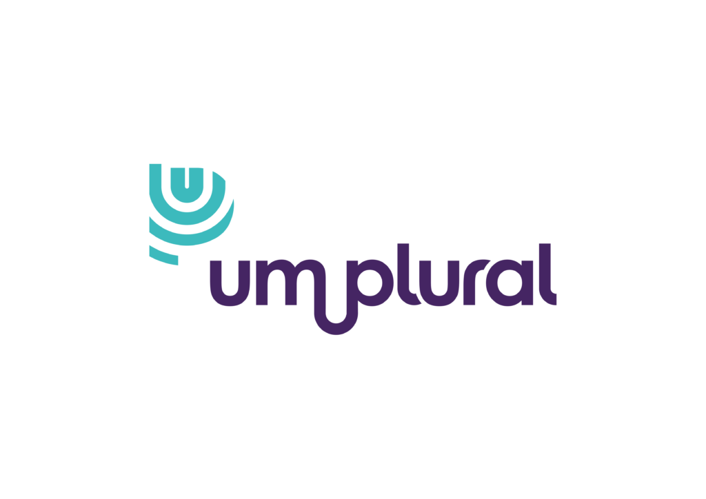
O design da marca comunica principalmente o líder e sua equipe convergindo suas ações em prol do bem comum, esta é forma com que o símbolo manifesta o propósito da marca. A estrutura deixa o símbolo alinhado ao topo, livre para emanar e convergir.
O verde, que dá cor ao símbolo, representa renovação e harmonia, enquanto o roxo agrega o conceito de poder, transformação e conhecimento. As cores equilibram a identidade, que é séria porém humana, e são cores livres de interpretações que envolvem gêneros. Enquanto isso, a tipografia exclusiva valoriza a identidade com letras diferenciadas, que estão representando o forte elo entre o ‘um’ e o ‘plural’.


BRIEFING
The beginning of this new company also required the development of its name. This should achieve some attributes such as: i) communicating branding strategies, ii) constructed with terms from the Portuguese language and, preferably, iii) the composition of a short name, with few letters.
The Branding strategy determined the company’s purpose as: “To help leaders accelerate their results through efficient, sustainable and trusting relationships with their teams.” The main challenge in creating business names is to translate this purpose into a name that summarizes this purpose as much as possible.
The UM PLURAL naming proposal reflects the following concept:
Consider each
part, but recognize
its role in the whole.
Understand the
essence of ONE but
communicate it to PLURAL.
This is a name of the type invented through the fusion of two terms with antagonistic meanings, but which complement each other.
UmPlural is a striking name, it expresses the concept of part and whole, so present in the organizational culture, in the holistic vision and even in the intention of establishing partnerships with other professionals.
The name Um Plural is directly linked to the brand’s purpose: to help leaders (one) accelerate their results through efficient, sustainable and trusting relationships with their teams (plural).
BRAND DESIGN AND VISUAL IDENTITY
The brand design mainly communicates the leader and his team converging their actions towards the common good, this is the way in which the symbol manifests the brand’s purpose. The structure leaves the symbol aligned at the top, free to emanate and converge.
Green, which gives color to the symbol, represents renewal and harmony, while purple adds the concept of power, transformation and knowledge. The colors balance identity, which is serious but human, and are colors free from interpretations that involve gender. Meanwhile, the exclusive typography enhances the identity with differentiated letters, which are representing the strong link between the ‘one’ and the ‘plural’.