REVOAR
Branding
Florianópolis/SC
2019
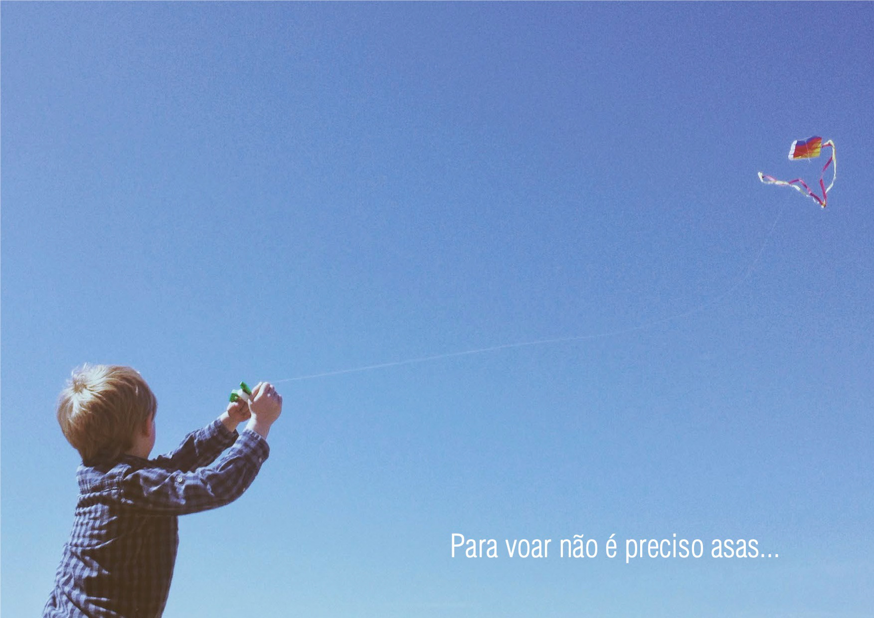
Revoar é uma marca que nasce com objetivo de expressar um conceito diferente no contexto de roupas infantis, libertador, lúdico, versátil e confortável. Além de se conectar com um estilo de vida contemporâneo com soluções inteligentes tanto na sua comunicação, relacionamento com clientes e desenvolvimento de produtos.
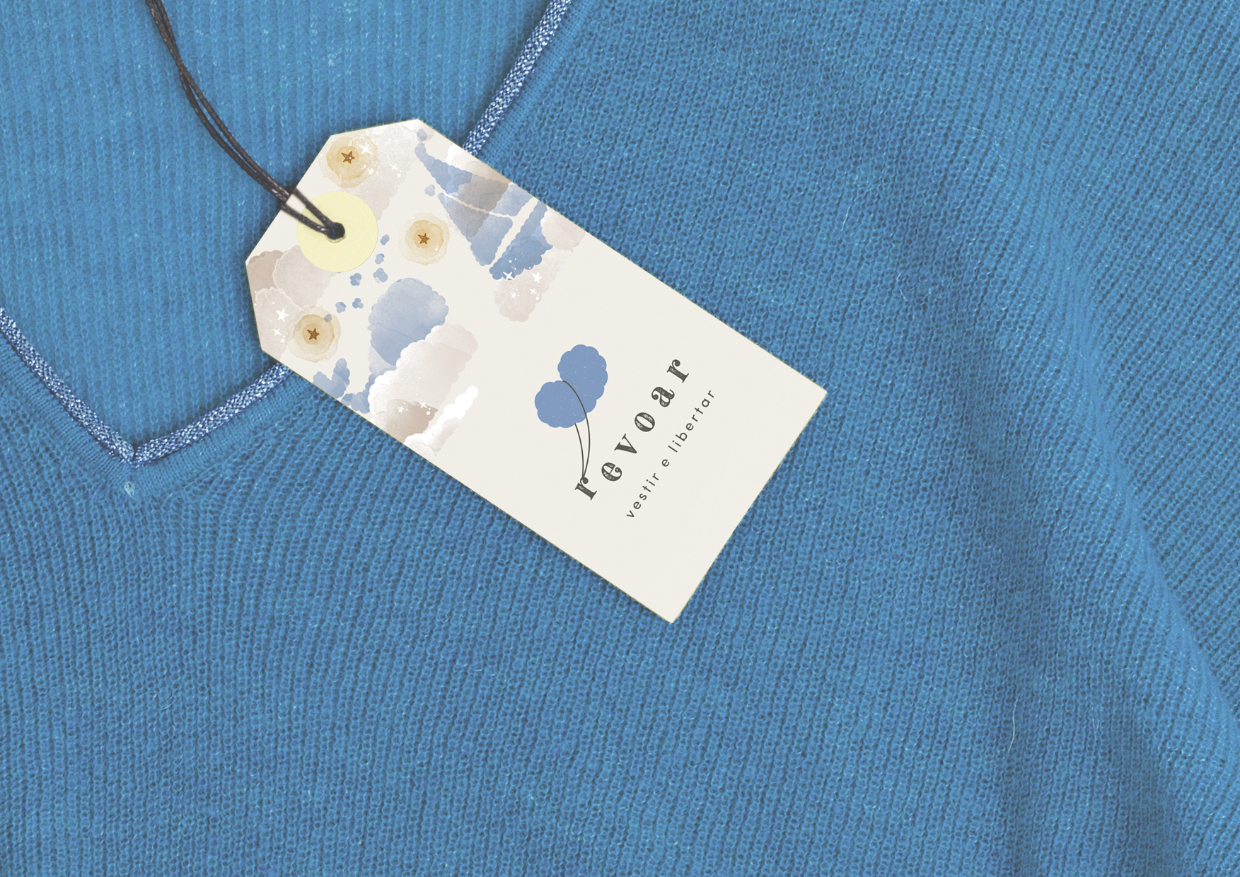
A ENTRE Gestão & Design é responsável pela construção da identidade visual da marca: definição de conceito, design de marca, imagem de apoio e algumas peças de comunicação institucional/promocional.
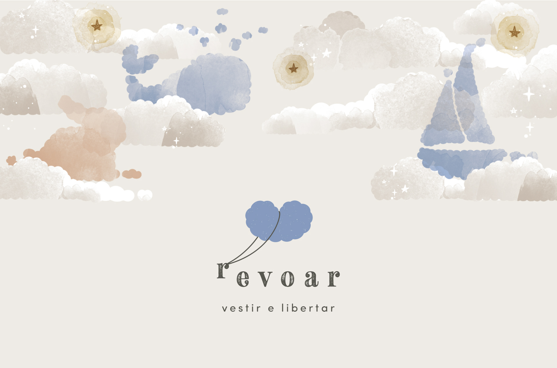
UM DESENHO DE MARCA LÚDICO
O desenho da marca alia os conceitos: da liberdade de voar, o lado lúdico de pegar carona na nuvem e o carinho ao vestir os pequenos (mostrado através do coração).
A nuvem traz neutralidade na representação dos gêneros. Também tem uma relação com o conceito de conforto, ela é leve, macia. É um símbolo democrático, pode ser reconhecido por todas as culturas.
As cores aplicadas são discretas, doces, elegantes e atemporais. A tipografia tem uma pitada nostálgica, que apesar de parecer contraditório é contemporâneo e atual.
A assinatura sugerida para a marca é a confirmação do propósito da empresa, e ela brinca com verbos no infinitivo, assim como o nome da marca: “Revoar – vestir e libertar”.

Revoar is a brand that was born with the objective of expressing a different concept in the context of children’s clothing, liberating, playful, versatile and comfortable. In addition to connecting with a contemporary lifestyle with smart solutions both in their communication, relationship with customers and product development.
ENTRE Gestão & Design is responsible for building the visual identity of the brand: concept definition, brand design, support image and some pieces of institutional / promotional communication.
A LUDIC BRAND DESIGN
The design of the brand combines the concepts: the freedom to fly, the playful side of hitchhiking in the cloud, the comfort in the cuteness of the cloud and the affection when dressing the little ones (shown through the heart).
The cloud brings neutrality in the representation of the genders. It also has a relationship with the concept of comfort, it is light, soft. It is a democratic symbol, it can be recognized by all cultures. The colors applied are discrete, sweet, elegant and timeless. The typography has a nostalgic hint, which despite being contradictory is contemporary and current.
The suggested signature is confirmation of the brand’s purpose, and it plays with verbs in the infinitive, as well as the brand name: fly, dress and release.