POLLUX
BrandingEmbalagem
Joinville/SC
2014
Pioneira na introdução das lâmpadas de LED no mercado brasileiro, em 2013, a Pollux procurou a ENTRE Gestão e Design para um diagnóstico de marca. A partir disso, investiu em design de marca e embalagens procurando se destacar em um mercado que busca por diferenciação e inovação.
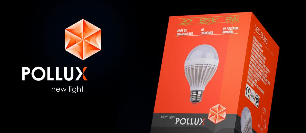
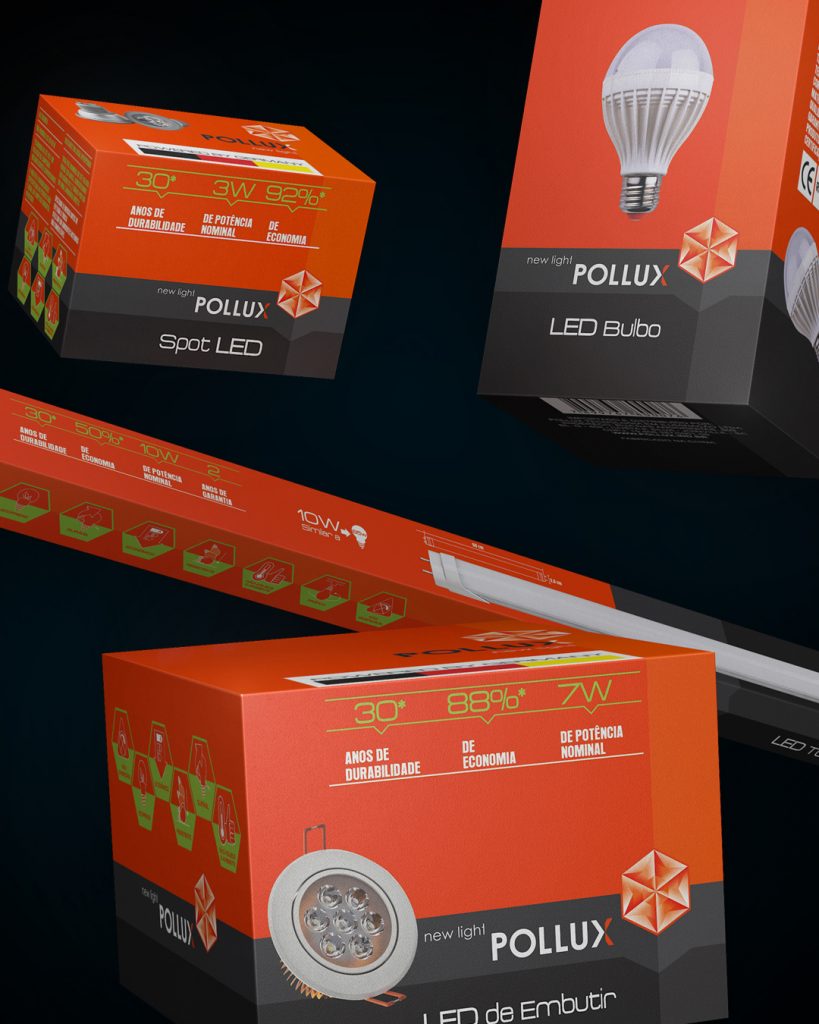
O desenho do símbolo representa uma estrela, o que faz relação direta ao nome Pollux – a estrela mais brilhante da constelação de Gemini.
A geometrização da forma remete ao comportamento físico da luz, que se expande. Os traços retos concretizam precisão e funcionalidade.
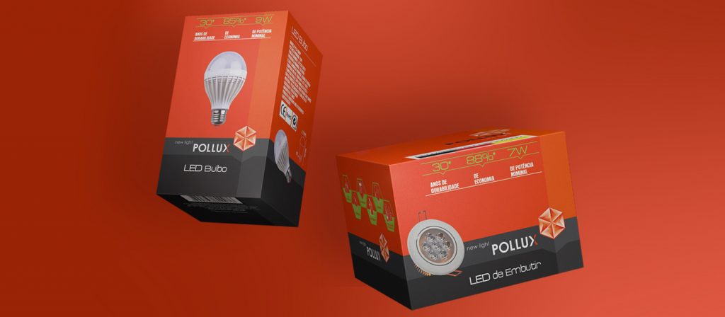
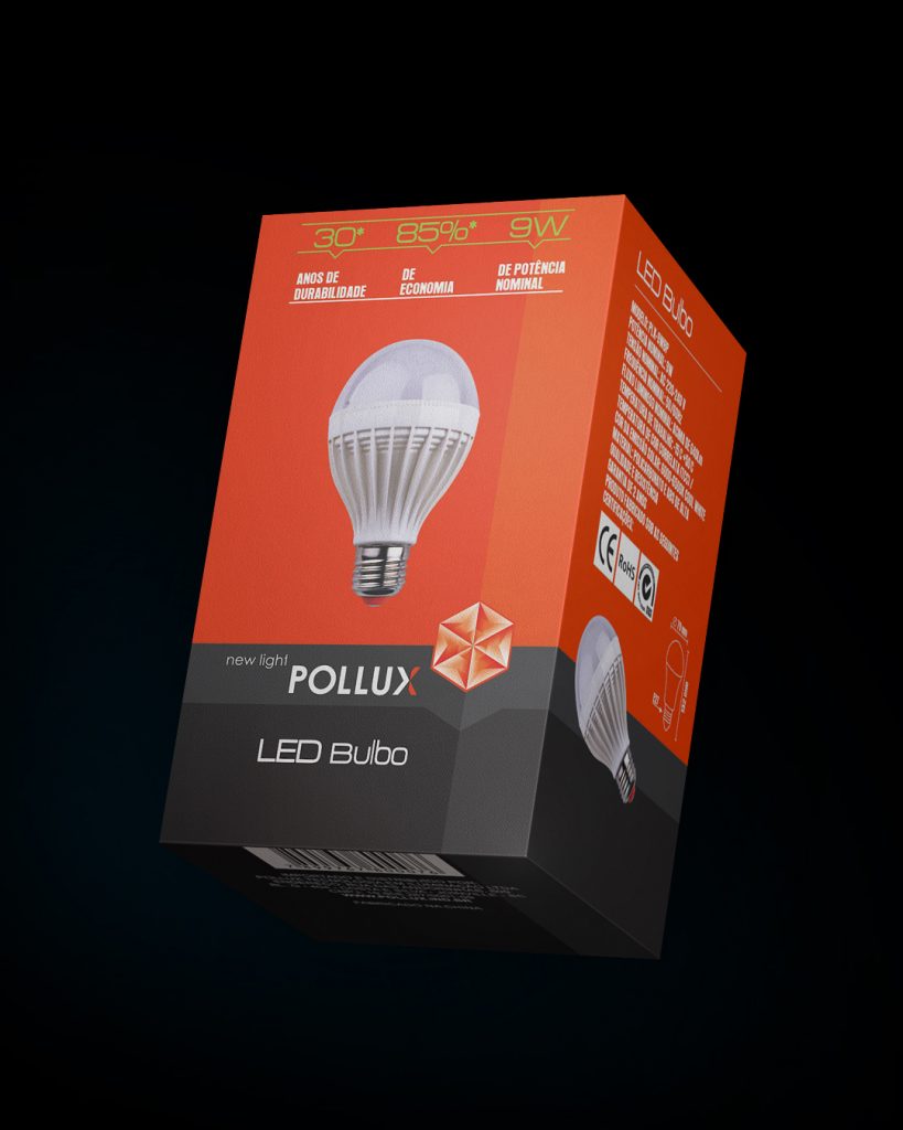
A construção do cenário de concorrentes gerou o diagnóstico de que as cores frias predominam nas embalagens da categoria. Então, a aplicação do laranja se tornou a chave para evidenciar os produtos Pollux no ponto de venda. O design também desmistifica a tecnologia LED, primeiro atraindo o olhar para as cores contrastantes e, depois, desvendando informações complexas sobre o produto, com ícones de fácil entendimento.
Pioneer in the introduction of LED bulbs in the Brazilian market, and through the diagnosis of ENTRE Gestão & Design, in 2013 Pollux invested in brand and packaging in a market that seeks differentiation and innovation. The design of the symbol represents a star, which is directly related to the name Pollux – the brightest star in the constellation Gemini. The geometrization of form is related to the physical behavior of light, which expands. Straight lines deliver precision and functionality. The construction of the scenario of competitors generated the diagnosis that cold colors predominate in the packaging of the category. Then, the application of orange became the key to evidence Pollux products at the point of sale. The design also demystifies LED technology, first attracting the eye to the contrasting colors and then unraveling complex information about the product with easy-to-understand icons.