FIOS DE OURO
BrandingEmbalagem
Camboriú/SC
2021
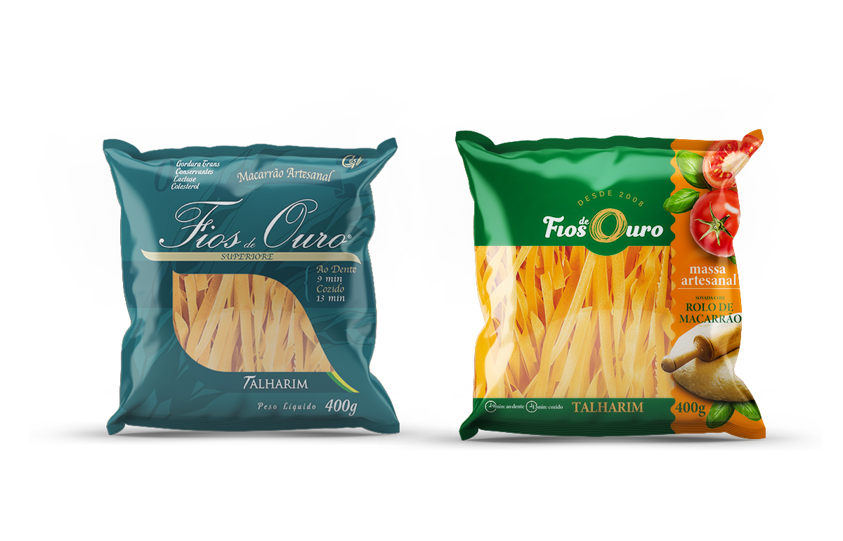
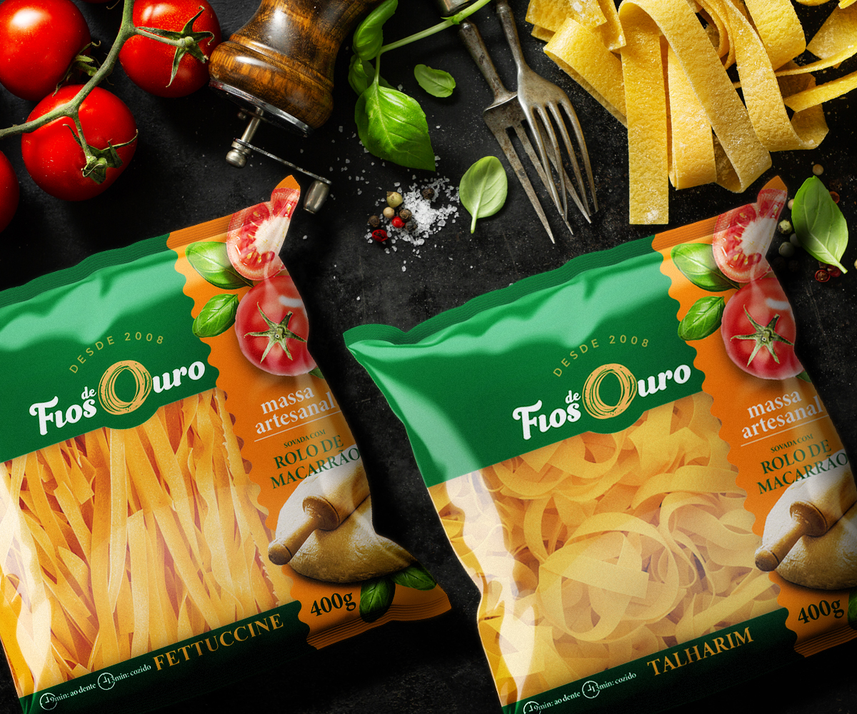
“Fios de Ouro” é uma marca de massas artesanais de propriedade da fabricante GS Massas. Em um diagnóstico inicial foi observado pela própria empresa a baixa percepção do produto no ponto de venda. Uma análise aprofundada demonstrou que o baixo constraste de cores, além da falta de sabor na embalagem contribuíram para a baixa competitividade em comparação aos principais concorrentes.
“Com a nova embalagem o tempo de reposição dos produtos na gôndola reduziu de 2 para 1 semana”.
Gilson Caldart, Proprietário da empresa GS Massas.
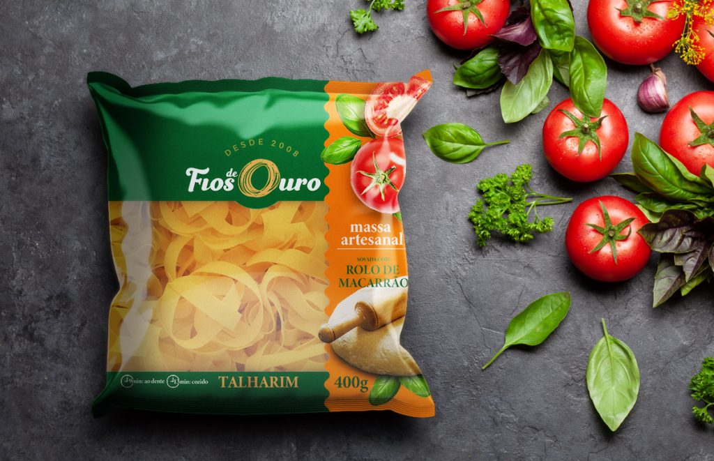
O CONCEITO
O principal desafio para o design das novas embalagens “Fios de Ouro” é traduzir na embalagem o diferencial do produto artesanal aliado com sabor.A solução encontrada se iniciou em estudar o mercado concorrente e identificar os pontos fortes e fracos da atual embalagem. Observou-se a necessidade de cores vivas e contrastantes. Um dos diferenciais da massa artesanal é o seu aspecto visual rústico. Para exibir o produto ao consumidor e favorecer o interesse de compra, a embalagem ganhou uma “janela” consideravelmente maior do que a embalagem anterior.Para corrigir a falta de sabor na comunicação visual da embalagem, elementos do contexto de consumo do produto fazem parte da nova programação visual. O destaque especial para o rolo de macarrão que ilustra a forma de fabricação do produto que é sovado com o mesmo. Um diferencial para uma massa artesanal perante os concorrentes industriais.
RESULTADO
As novas embalagens chegaram ao mercado e em pouco tempo os resultados foram alcançados. “Com as novas embalagens o tempo de reposição dos produtos na gôndola reduziu de 2 para 1 semana”, segundo Gilson Caldart, proprietário da GS Massas.
“Fios de Ouro” is a handcrafted pasta brand owned by the manufacturer GS Massas. In an initial diagnosis, the company itself observed the low perception of the product at the point of sale. A detailed analysis that the low contrast of cores, in addition to the lack of flavor on the packaging contributed to the low differentiated compared to the main ones.”With the new packaging, the replacement time for products on the shelf was reduced from 2 to 1 week”. Gilson Caldart, Owner of the company GS Massas.
THE CONCEPT
The main challenge for the design of the new “Fios de Ouro” packaging is to translate into the packaging the differential of the artisanal product combined with flavor.
The solution found began by studying the competitor market and identifying the strengths and weaknesses of the current packaging. The need for bright and contrasting colors was noted. One of the differentials of the artisan dough is its rustic look. In order to display the product to the consumer and favor the purchase interest, the packaging gained a “window” considerably larger than the previous packaging.
To correct the lack of flavor in the packaging’s visual communication, elements of the product’s consumption context are part of the new visual programming. The special highlight for the noodle roll, which illustrates the way in which the product that is kneaded with it is manufactured. A differential for an artisanal pasta compared to industrial competitors.
RESULT
The new packages arrived on the market and in a short time the results were achieved. “With the new packaging, the replacement time for products on the shelf was reduced from 2 to 1 week”, according to Gilson Caldart, owner of GS Massas.