AÇAÍ DA VILA
BrandingEmbalagem
Joinville/SC
2016
Através de um estudo de concorrentes da região, público nacional e público-alvo, a marca traz o conceito de “comer direto da fruta”, que expressa a qualidade natural do produto. A marca traz predominantemente formas orgânicas, e o desenho de uma colher no centro, que também se assemelha às folhas finas da palmeira do açaí. Sua cor verde aumenta ainda mais a percepção de um produto natural. Além disso, as formas arredondadas são uma representação da textura açaí cremosa e dão movimento ao desenho.
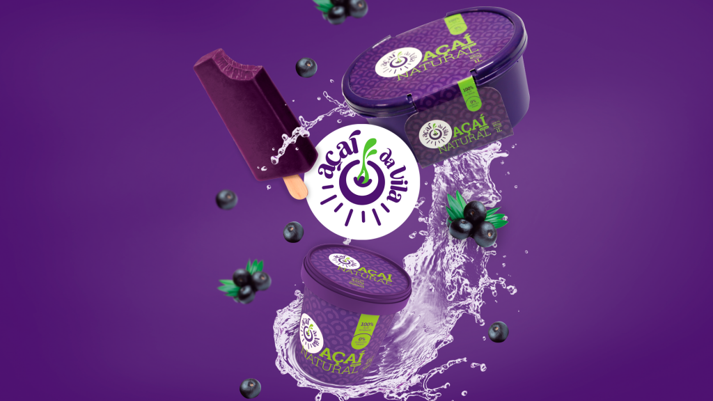
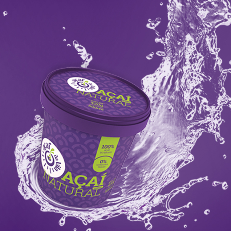
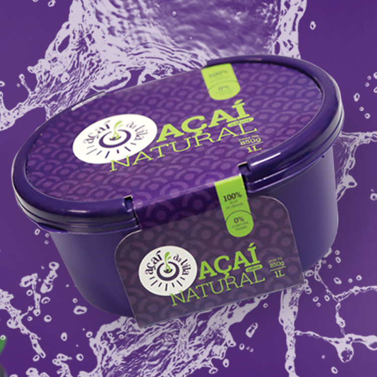
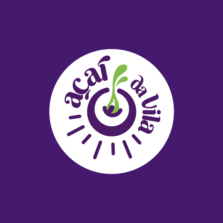
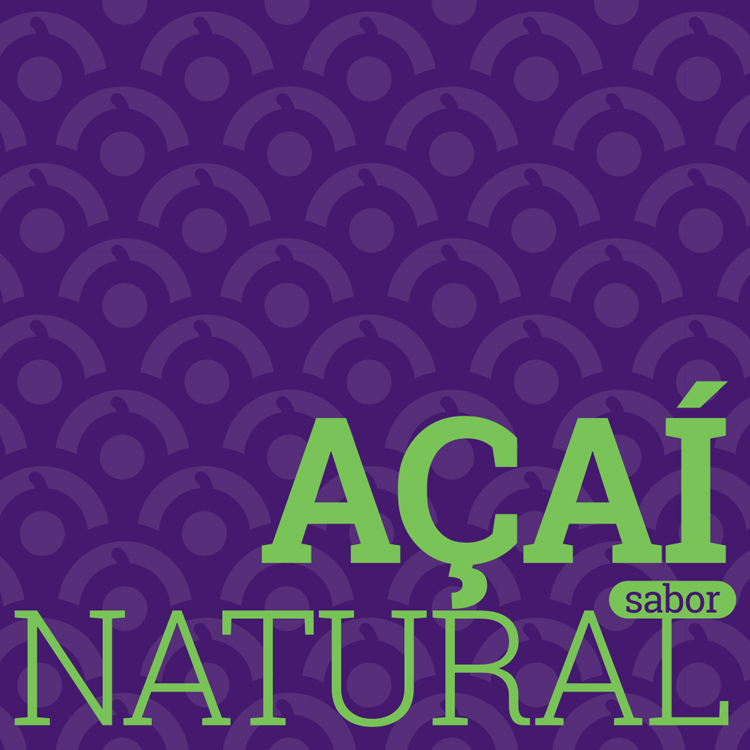
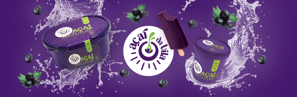
Through a study of regional competitors, national and also the target public, the brand has the concept of “eat direct from the fruit”, which expresses the natural quality of the product. The brand brings predominantly organic forms, and the draw of a spoon in the center, which also resembles the fine leaves of the açaí palm. Its green color further enhances the perception of a natural product. In addition, the rounded shapes are a representation of the creamy açaí texture, and give movement to the drawing.