SINCERE
Project Naming, Branding, Embalagem
Year 2025
Local Brasil, Palhoça
Sincere is a dermocosmetics brand with a significant differentiator: through its own R&D, it develops and proves the efficacy of its formulas, delivering products to consumers with honest promises.
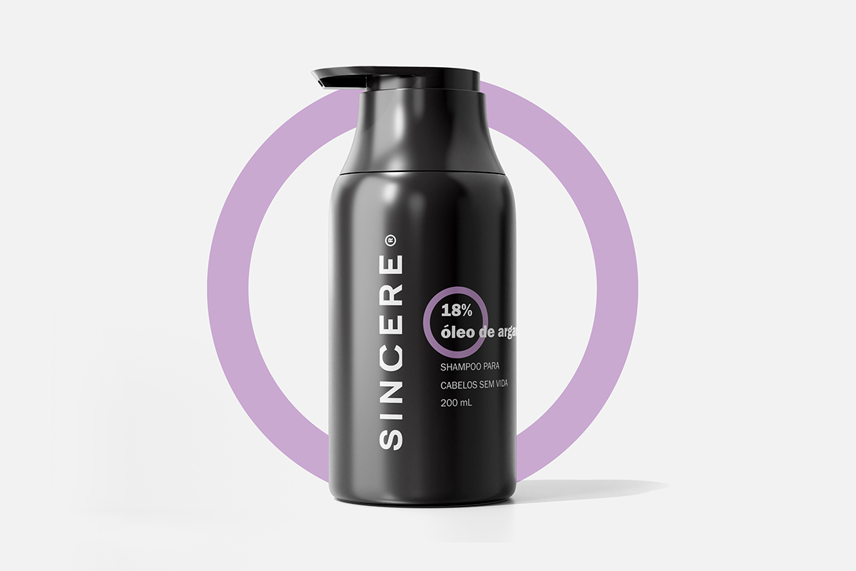
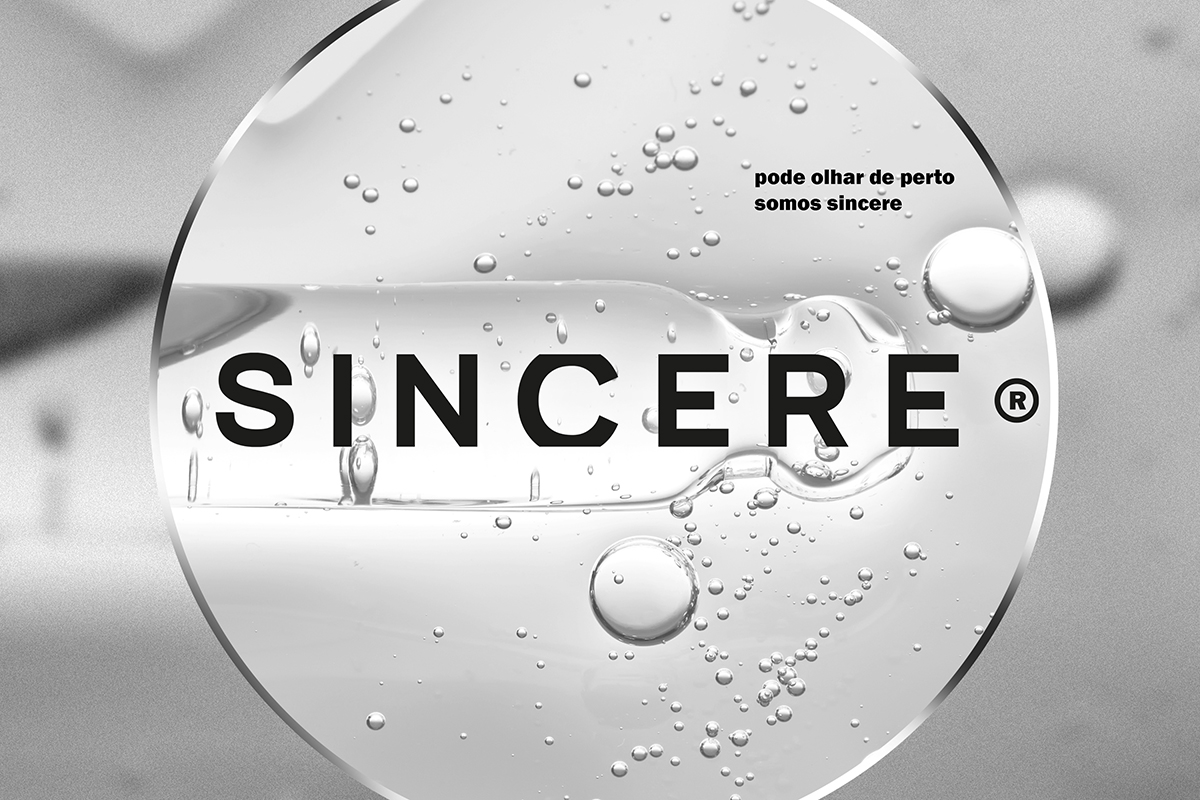
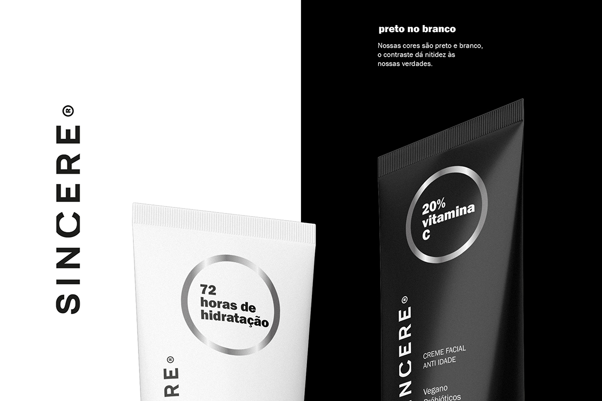
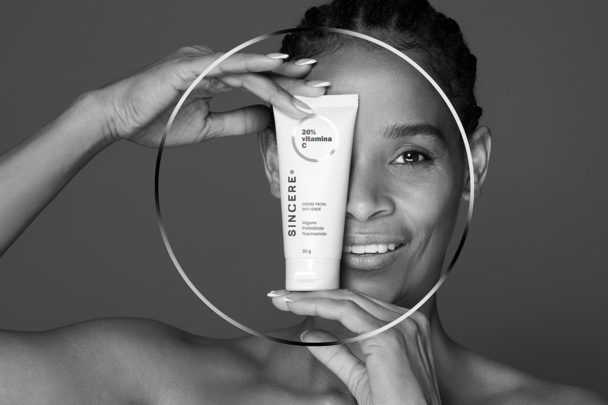
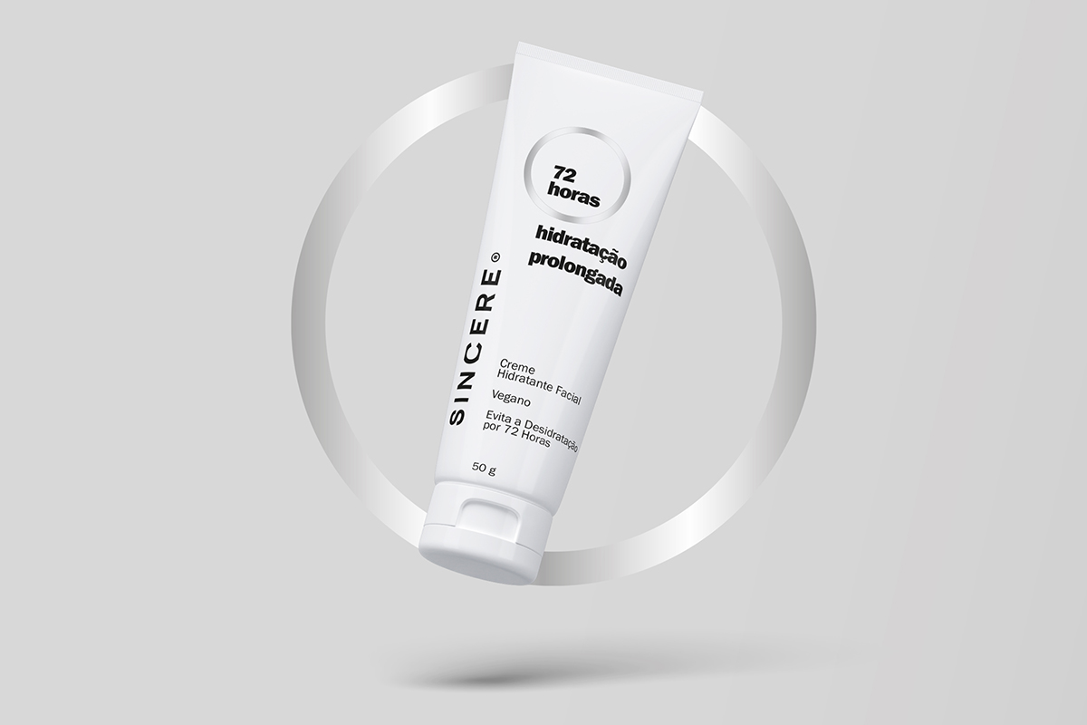
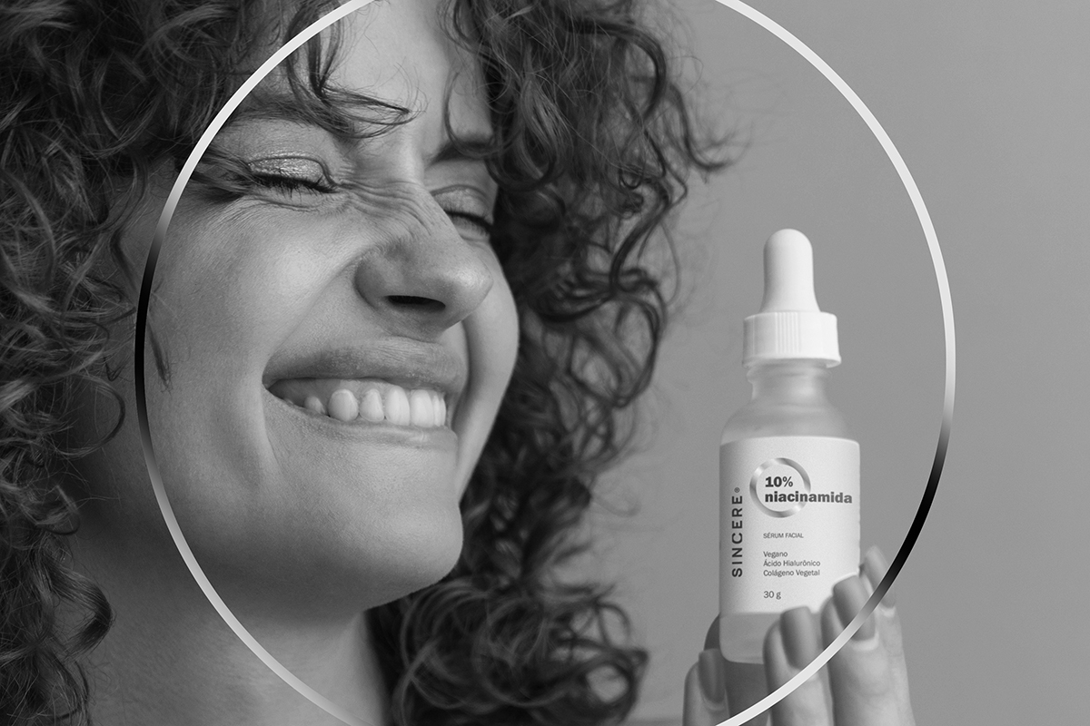
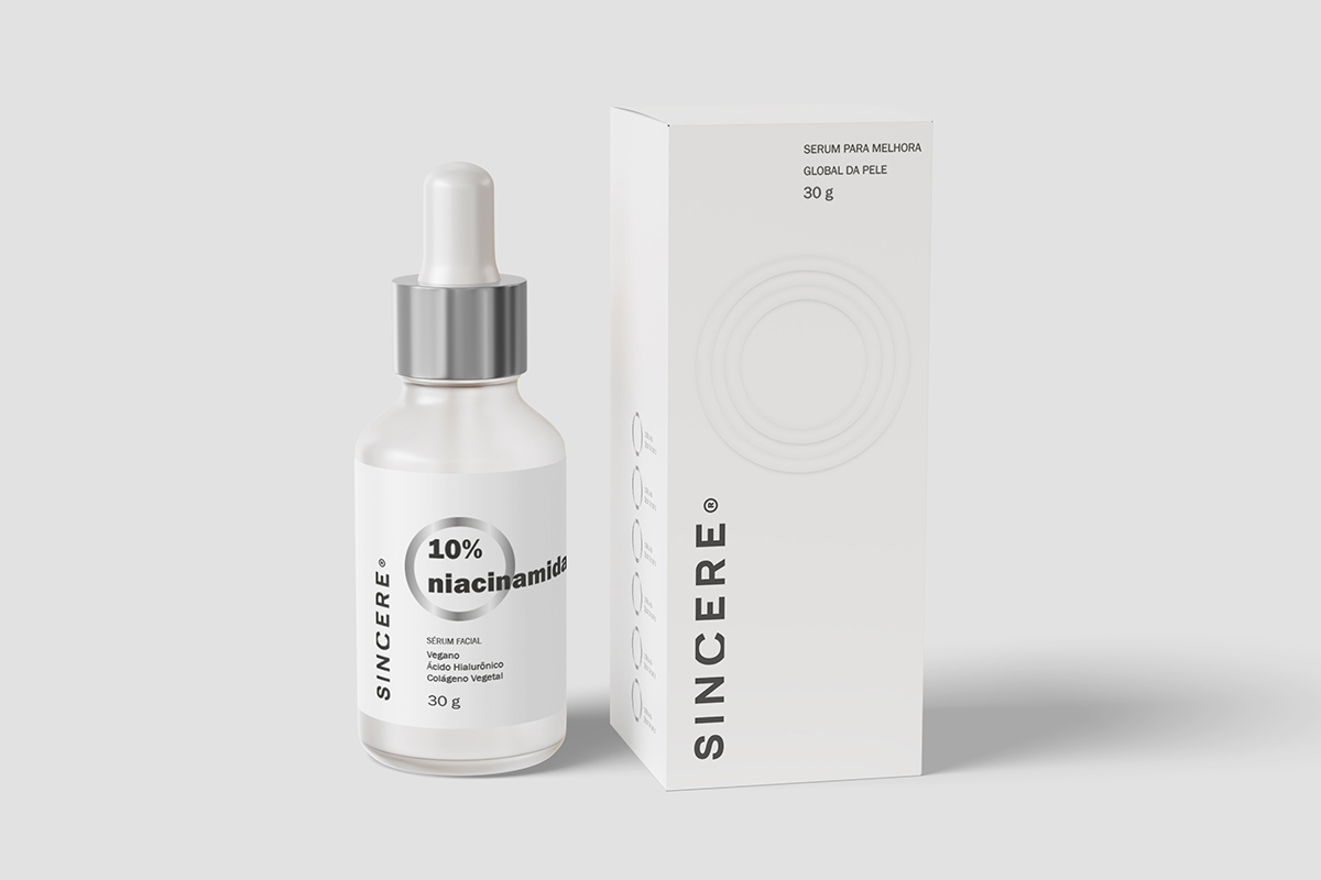
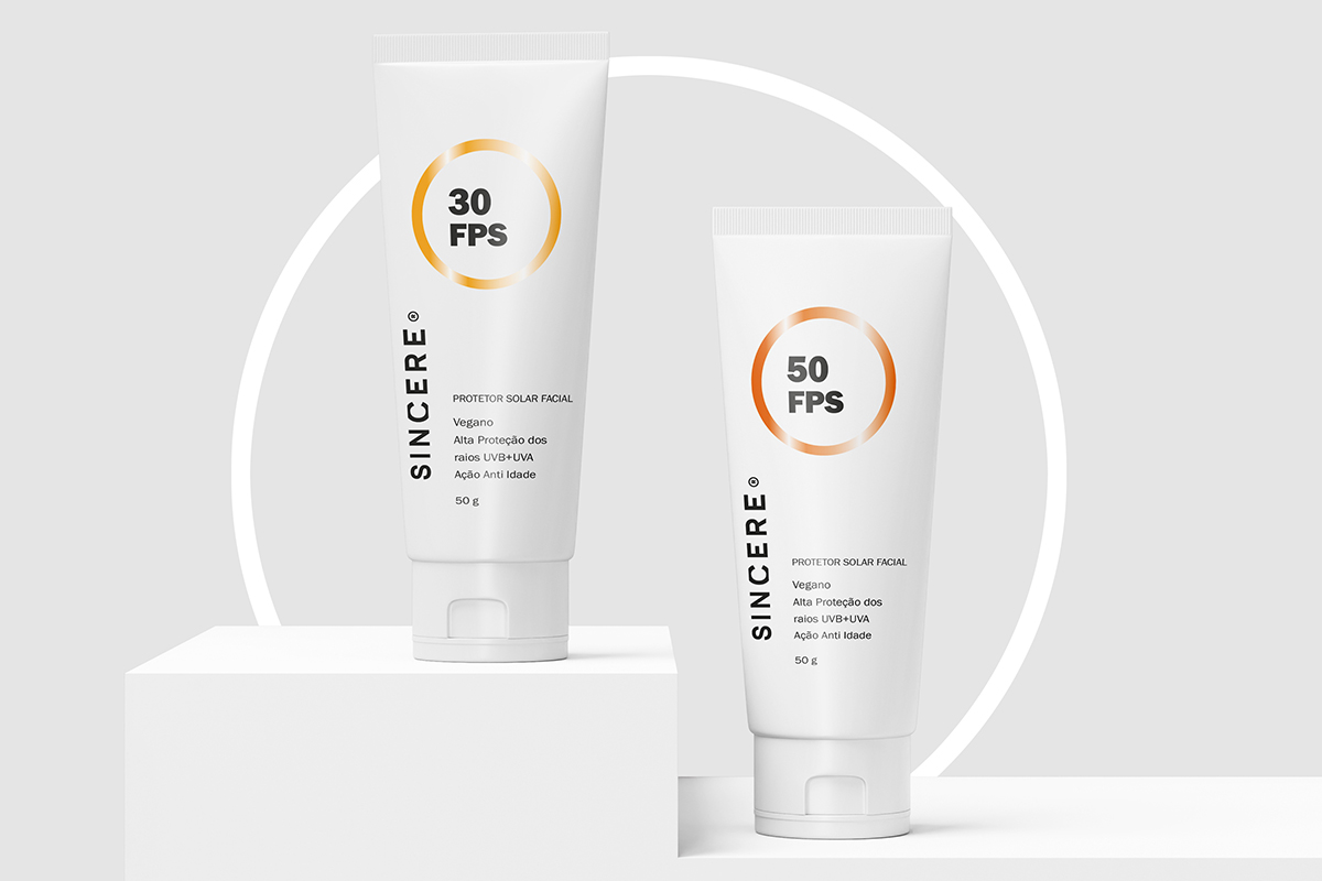
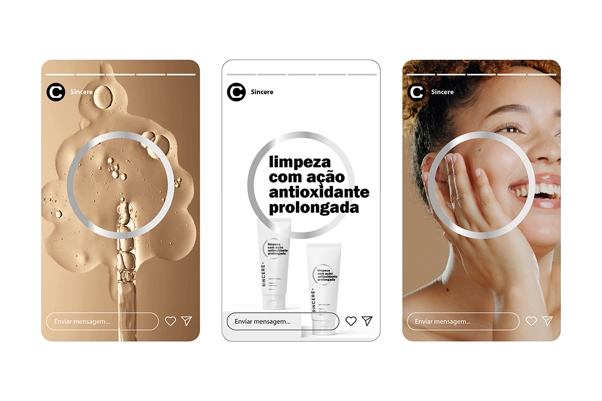
It was this ‘sincere soul’ that inspired us in planning the brand strategy and creating the name, visual identity, and packaging that manifest the truth in different ways. The cut in the letter ‘C’ within the brand design creates a sense of magnification, as if the brand were saying: ‘take a closer look, we are authentic.’ In the clean-label packaging, a circle amplifies the product’s core truth, whether it is a formula component or a specific benefit. The strategy also accounted for the brand’s ambition to operate in international markets, proposing design solutions with global appeal.
BRIEFING
Supporting the positioning of a new brand in an extremely competitive market, while highlighting its in-house R&D as a key differentiator—ensuring exclusive formulas, domestic technology, and proven results. The potential for export required design solutions that could compete at a high level and be understood globally.
CONCEPT
Seeking inspiration to manifest the purpose of this new dermocosmetics brand, we immersed ourselves in the laboratory environment where research, development, and efficacy testing take place. In the lab, this process involves looking closely—at a microscopic level—at formulations, skin tissues, and their transformations, among many other components. In creating the name, the act of “looking closely” led us to the concept of sincerity. In the brand design, this is represented by a “zoom” effect that cuts into the letter “C.” For the packaging graphics, a circle serves as a zoom lens, highlighting each product’s most relevant differentiators.
RESULT
The immersion into the world of cosmetic industry laboratories provided a concept that could be applied across all brand touchpoints through design. In the naming process, the act of observing closely through microscopes brought us to the concept of sincerity. To ensure the name was globally understood, we translated the term “sincera” into English as “Sincere.” The first sign of the name’s success was securing the trademark registration with the INPI. In the visual identity, the letter “C” features a cropped design, as if being analyzed under a microscope. In the packaging system, the circle represents a zoom lens that showcases the most significant benefits of each product.
See more cases: